AI and Data Visualization: Making Statistical Graphs Easy for Beginners
Updated · Jun 03, 2025

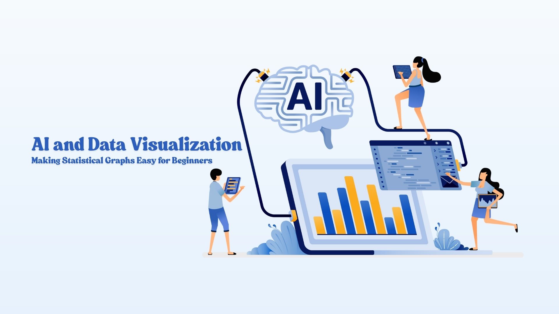
Table of Contents
In many parts of today’s society, graphs and charts appear everywhere, on TV, in newspapers and in our schoolbooks. It used to be tough to make those graphs. Data analysis, making the best graph choice and carefully creating it all were essential steps.
Now, with the help of Artificial Intelligence (AI), generating graphs is much simpler than before.
Even if you are a learner using math or a teacher guiding classmates, AI can change numbers into easy-to-see, colorful pictures instantly. We will examine in this guide how AI is impacting learning and understanding statistics.
What Is AI-Powered Data Visualization?
Showing data through charts and graphs is what data visualization does. Thanks to AI, computers can now look at the data and pick out the best way to display it.
Just like AI voice cloning replicates human speech, AI-powered visualization tools replicate human decision-making in presenting insights.
It doesn’t take Excel or you to test different graph styles—an AI tool can automatically suggest using a line graph. Learning feels easy because you have the support of a personal math expert.
How AI Simplifies Statistical Graphs
For example, you have collected test scores for your students. Your goal is to represent everyone’s input with a graph. On normal occasions, this is how things would turn out:
- Determine which kind of graph you need
- Be sure to enter all the data as required.
- Arrange the graph so anyone can follow its information.
Simply upload your data into the AI tool or paste it right into the app. Within seconds, AI is capable of completing all of the tasks described. Here’s why it simplifies things for you:
Automatic Graph Selection: AI chooses the best type of graph based on your data—like a pie chart for percentages or a bar graph for comparisons.
Error-Free Analysis: AI tools can catch mistakes in your numbers and help you fix them before creating the graph.
Simple Explanations: Many AI tools add notes or insights to help you understand what the graph is showing—like highlighting trends or showing average scores.
Real-Time Updates: If your data changes, the graph updates itself automatically. No need to do it all over again!
Top AI Tools for Visualizing Statistics
AI tools the come in handy for exploring, analyzing and viewing statistics.
Starting with AI doesn’t have to be hard thanks to these tools that help you make graphs quickly:
AI-integrated Google Charts
Using AI, Google Charts and Google Sheets together to produce smart charts and graphs. All you do is type in the data and the spreadsheet shows you the best graphs to use.
Tableau Public with Artificial Intelligence suggestions
Tableau Public is an effective program available at no cost for students. The AI in the tool guides you on which graphing options will be best and shares helpful information about your data.
ChartGPT
With ChartGPT, you can have conversations with an AI. For example, you may ask “Show a bar graph of student scores,” and the chart is produced right away.
AI Version of Canva Graph Maker
Design is Canva’s strong point, but its AI graph maker makes it extremely easy to create charts and infographics.
Using Power BI as an Advanced Student
Microsoft’s Power BI uses AI to help identify trends within big data sets. It’s perfect for school projects and coming up with science fair ideas.
Benefits for Students and Educators
It’s more than just making data presentation more convenient. It also assists with learning and teaching. Here’s how:
For Students
- Creates a Fun Experience for Math: Creating colorful graphs with the numbers makes it easier for students to understand what they represent.
- Better Understanding: It is simpler to learn complicated subjects such as averages, trends and comparisons with visual assistance.
- Faster Projects: AI tools assist students in completing math and science projects both promptly and with fewer mistakes.
For Educators
- Simplifies Teaching: If teachers use the graphs tool, they can make graphs seconds after the lesson begins.
- Gets students involved in the lesson: Having visual resources adds interest and makes the lesson simpler to grasp.
- Helps Everyone Learn: Graphs are useful for understanding no matter if a student learns by seeing, hearing or doing.
Real-World Cases: AI Making Graph Learning Easy
In a middle school science class, students were asked to track daily temperatures for a week. Instead of drawing graphs by hand, their teacher used ChartGPT to input the data and instantly generate a line graph.
The AI also highlighted the day with the highest temperature and explained the pattern in simple terms, helping the students understand the concept of trends.
In another case, a high school math teacher used Google Sheets with AI suggestions during an online class. She entered student quiz scores, and the tool recommended a bar chart that showed class performance clearly.
Students could see how they performed compared to the average, making discussions about improvement more engaging.
At a learning center, students used Canva’s AI Graph Maker to present survey data about their favorite school subjects.
The AI-generated pie charts made it easy for even younger students to understand percentages and preferences visually, helping them gain confidence in using statistics.
Future of AI in Math and Stat Learning
AI will keep changing how we learn math and statistics. In the future:
- Voice-Based Graph Creation: Students might say “Draw a line graph of temperature over 5 days,” and AI will do it instantly.
- Personalized Learning: AI can check which graphs you understand best and suggest practice based on that.
- Interactive Graphs: Touch a part of a graph and it explains itself—like showing how much each student scored.
- Integration in Classrooms: Schools will use smart boards and apps that connect AI graphs to real-time data like weather or stock prices.
Conclusion
AI-powered data visualization is a game-changer for students and teachers. It turns boring numbers into exciting stories using graphs and charts.
You no longer need to worry about what type of graph to use or how to draw it neatly. With the help of AI, math becomes easier, clearer, and more enjoyable.
Whether you’re a student making a project or a teacher preparing a lesson, AI tools are like friendly assistants that help you every step of the way.
As technology grows, these tools will become even smarter and more helpful. So go ahead—use AI to make your graphs come alive and let your numbers tell a story!

Tajammul Pangarkar is the co-founder of a PR firm and the Chief Technology Officer at Prudour Research Firm. With a Bachelor of Engineering in Information Technology from Shivaji University, Tajammul brings over ten years of expertise in digital marketing to his roles. He excels at gathering and analyzing data, producing detailed statistics on various trending topics that help shape industry perspectives. Tajammul's deep-seated experience in mobile technology and industry research often shines through in his insightful analyses. He is keen on decoding tech trends, examining mobile applications, and enhancing general tech awareness. His writings frequently appear in numerous industry-specific magazines and forums, where he shares his knowledge and insights. When he's not immersed in technology, Tajammul enjoys playing table tennis. This hobby provides him with a refreshing break and allows him to engage in something he loves outside of his professional life. Whether he's analyzing data or serving a fast ball, Tajammul demonstrates dedication and passion in every endeavor.